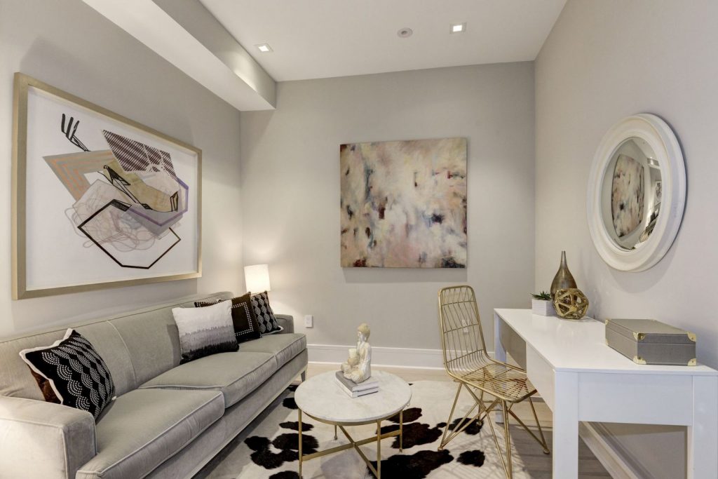
Hanging art and décor is a fun way to fill up your wall space and add some personality to a room! There are a ton of different designs, styles, and layout options to choose from when incorporating wall art into your interior design.
You might think it’s as simple as getting a piece that matches the rest of your décor and throwing it up wherever it fits, but hanging art properly requires more strategy than that. We’ve decided to highlight the three most common mistakes people make when using wall décor. Take a look at what they are to make sure you’re not guilty of making them yourself!

1.) Choosing the wrong size.
When it comes to size, people tend to go too small with their wall art but missing the mark in either direction is a big interior design faux pas! An itty bitty piece of art floating awkwardly in a big space does not work well, making the room seem out of balance and proportion. Unless you are going to balance it out with a lot of additional art to fill the space, resist hanging a small piece of art anywhere but on a smaller section of wall.
Similarly, art that’s too big for a small wall will overwhelm the room and throw off the scale. A huge piece of art on a large wall can really work if it takes up proportional space, but watch out for hanging art that is too wide on a narrow wall—it leaves too much space on the top and bottom and not enough on the sides.
Hanging art that isn’t the right proportion for the wall will be a distraction—something that just doesn’t look right and turns off guests or potential buyers if you’re showing your home. Take the time to experiment with proportions before you buy your pieces. Hang a piece of paper that is cut to size and see what feels most comfortable in the space.
2.) Hanging art too high.
This is another common décor mishap that makes a room feel off. Hanging your wall pieces too high will throw off the atmosphere and symmetry of a room, even if it’s just a few inches. You want your wall art to be cohesive with your furniture, room shape, and ceiling height to establish harmony.
The center of your art installation should be placed roughly at eye level and so that you shouldn’t have to look up to see it while sitting. Since everybody’s eye level will differ depending on height, the magic number most interior designers will tell you is 57’’ from the floor. If you’re tall, hold up the piece at eye level and then come down a few inches and you’ll find the sweet spot. If you’re opting for a gallery wall of many pieces of art, use this guide to inform where the center of the installation is.
Ask yourself if your can view a piece comfortably while standing in front of it and use that as a guide to proper placement height.
3.) Using art that doesn’t flow.
A lot of people make the mistake of hanging wall art just because they have it. It’s important, however, to make sure each piece matches the style of the room. You wouldn’t throw a red ottoman into a living room with a cool blue color scheme just because you found it in the basement—don’t do it with your wall art either!
The nice thing about wall décor is that it’s easy to swap out and rotate as your tastes and fashion trends change! Switch things up by moving a couple pieces from your study into the den or bringing out some seasonal art throughout the year.
Wall art is a very powerful tool for determining the look and feel of each room, making it especially important when it comes to staging your home for prospective buyers. At Red House Staging & Interiors, we know exactly how to use that and other interior design elements to make the most of your space. Give us a call or visit our website today to learn more about what our elite staging services can do for your home sale!
